To Kill A Mocking Bird -Analysis
I particularly like this title sequence as it give the audience insight into the main character and their obsession in this case her "treasure chest" and how that later on will play a vital part in the film. I also like that it doesn't show the characters face, however you are still able to know that she is young through her continuous humming and child like lines that she is drawing. Along with this the fact that the title sequence is in black and white stops the audience from becoming distracted by bright colours but rather causes them to focus solely on what's going on.
To the left is the embedded title sequence and below are a few image stills from the title sequence.


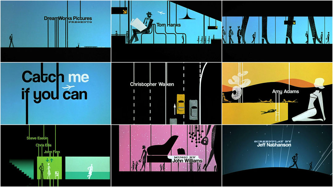
Catch Me If You Can- Analysis
In comparison to "To Kill a Mockingbird" Catch me if you can seems more light hearted and animated. This is due to the bright colours and the typography that is used in the title sequence. By doing this it is able to tell the audience that the genre of the film is most likely a comedy or light hearted children film, due to the animation and the highly saturated colours. To the left is the embedded title sequence for the film Catch Me If You Can and below are a few image stills from the title sequence.
No comments:
Post a Comment